How do you visualize scientific collaborations?

 Multi-centre projects—such as EU framework consortia—are expected to create strong interactions between different groups. How can we evaluate and visualise the collaborative effort in a clear, understandable way?
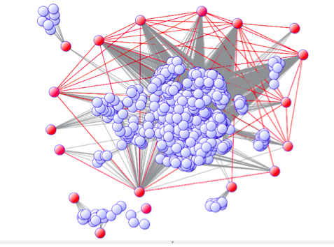
If a picture is worth a thousand words, a graphic can illustrate scientific interactions with amazing clarity. See, for example, the picture below, which I made for the Publishable Final Report of an EU consortium.
The graph is based on a sophisticated analysis of 116 peer-reviewed publications originated from the consortium. Principal investigators (PIs) from the consortium are represented as red balls, whereas all other co-authors are represented as blue balls. Authors who published at least one paper together are connected by a line. In this way, it’s easy to visualise the interconnection between groups that have worked together. In our figure, a significant number of PIs have co-authored one or more papers (red lines) and are part of a significant co-publishing network, which indicates a high level of collaboration.
Even without looking at the underlying data, non-technical readers can get the correct idea that the consortium established fruitful scientific collaborations.
I am proficient with advanced bibliometric tools for measuring and visualising scientific publications and collaborations. Using these powerful analyses, I provide my clients with useful tools for strategic planning and evaluation and with self-explaining data for their reports.